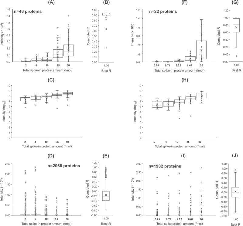
FIGURE 2.

Results of LFQ analysis in DDASSQ workflow. Box‐plot graphs on the left‐hand side: UPS standard proteins (A, F) and Saccharomyces cerevisiae background proteins (D, I) individual intensities quantified in samples Pursiheimo et al. (ref. [26]) and Tabb et al. (ref. [27], respectively). Graphs C and H: log‐transformed LC‐MS UPS protein intensities. The number of identified spike‐in UPS standard protein and of S. cerevisiae background proteins are reported in the corresponding graphs. Side box‐plot graphs (B, E, G, J): pairwise comparison‐based distribution of the correlation coefficients between experimental/theoretical UPS ratios across the tested dilutions for the two sets of proteins, UPS (B, G) and S. cerevisiae (E, J) (R‐value computed from experimental data versus best R‐value=1)
