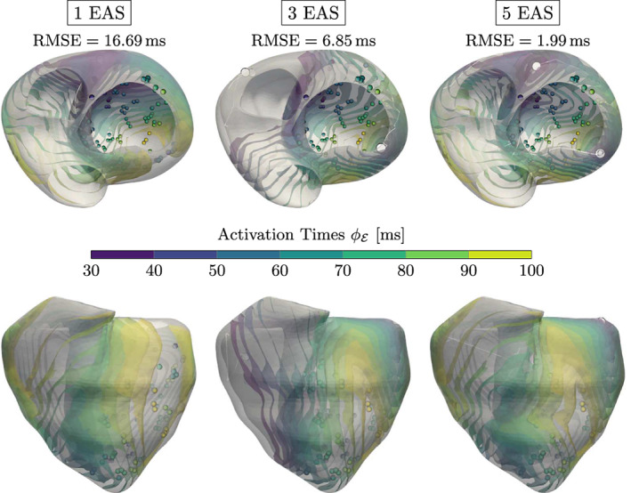
FIGURE 10.

Results for the CRT experiment with varying number of EASs along with the RMSE (in ms) shown above each experiment. The color‐coded spheres indicate the observed activation times, while the white circles represent the optimized EAS positions. The white trailing paths show the optimization path over the iterations. Increasing lowers the overall RMSE, but may result in physiologically unlikely EAS (e.g., top of the left ventricle for )
