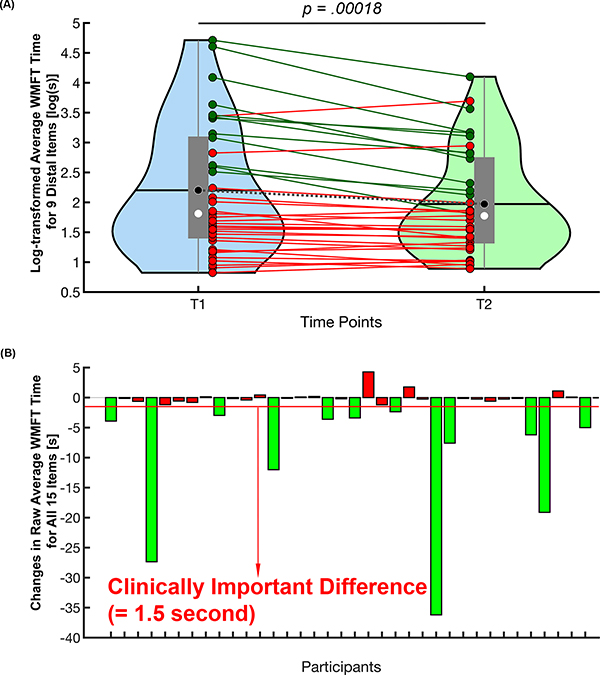
Figure 1.
The difference in average WMFT time between baseline (T1) and 4-month post-baseline (T2). (A) Group difference in log-transformed average WMFT time for 9 distal control items between 2 time points. The central gray boxes are the interquartile ranges; black horizontal lines and black circles are the means; white circles are the medians; the gray whiskers above and below the boxes are the locations of the minimum and maximum values; the violin plot indicates the distribution of data for each time point. Each individual solid line indicates each participant’s change in log-transformed average WMFT for distal control items (dark green lines—participants who had clinically important difference (CID) in average WMFT time for all 15 items; red lines—participants who did not show CID). The dotted gray line represents the group mean change in log-transformed average WMFT for distal control items. (B) The CID in average WMFT time for all 15 items. Green bars indicate those participants who demonstrated WMFT CID. Note that we used the CID of raw average WMFT time score from the 15-item battery, as there is no CID defined for log-transformed average WMFT time for the 9 distal control items. WMFT indicates Wolf Motor Function Test. This figure is available in color online (www.jnpt.org).

