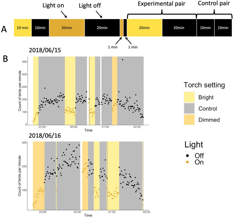
Figure 4.
(A) Visualisation of treatment series of the interval experiment. Each segment corresponds to the colour (yellow = bright white, orange = dimmed white, black = light off) and duration for which the light was on (or off). In the experimental pairs, we turned the light on and off for different lengths of time (1-, 10- and 20-min intervals). In the control pairs we turned the light off for two consecutive intervals (‘light-off’, ‘light-off’). (B) Two example days, 15th and 16th June 2018, of the interval experiment. The graphs show the count of birds per minute against time. Different colour bars represent different settings (bright white, dimmed white and control) and the two dot colours represent light on (yellow) and off (black). White bars represent breaks in the experiment caused mainly by switching to a new recording or by technical mistakes.

