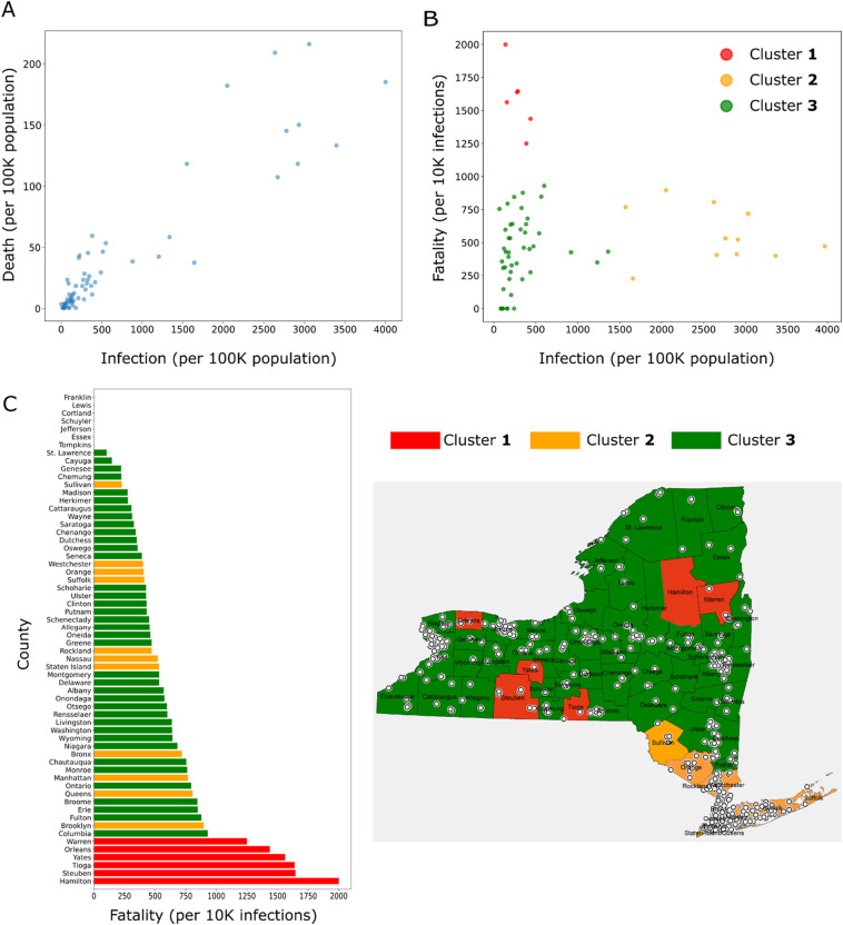
Fig. 2.
(A) Scatter plot showing the relationship between COVID-19 infection and death rates in NYS counties. (B) Fatality rate is plotted against infection rate for each county; the counties are further grouped for fatality into 3 clusters using two-dimensional k-means clustering method. Cluster 1 includes counties with high fatality and low infection; cluster 2 includes counties with low fatality and high infection; cluster 3 includes counties with low fatality and low infection. (C) Fatality rates of the counties with the clusters indicated by color (left); map of NYS showing the locations of counties belonging to each cluster (right). Locations of nursing homes are also depicted in the map by white circles.

