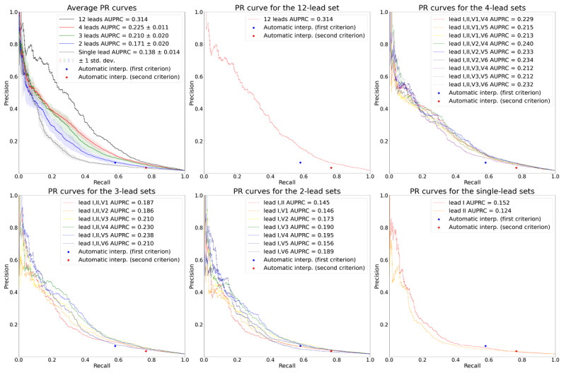
Figure 5.

PR curves for the various target lead sets. The plot on the upper left shows the average PR curves according to the number of leads. The solid lines depict the average PR curves, and the shaded areas depict 1 SD of the PR curves. The rest of the plots show the PR curves for the 12-, 4-, 3-, 2-, and single-lead sets, respectively. In all plots, the performance of the automatic ECG interpretations is depicted as dots. AUPRC: area under the precision-recall curve; PR: precision-recall.
