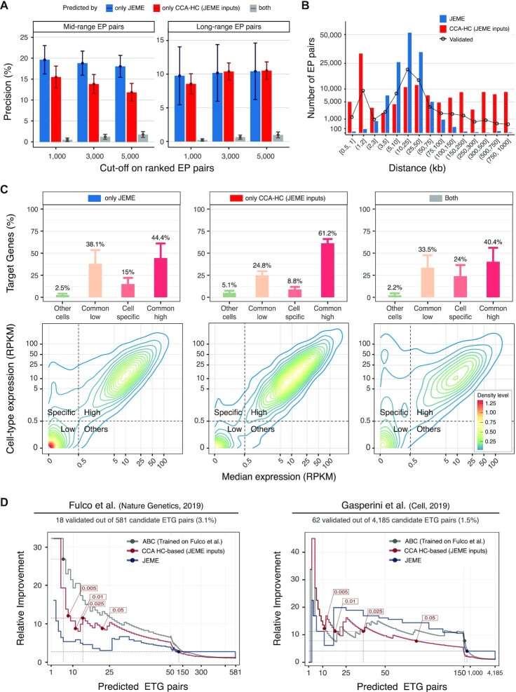
Figure 6.
Cell specificity of the predicted enhancer−promoter pairs. (A) Average precision (bars) and ±1 standard deviation (whiskers) assessed based on mid-range (eQTLs supported, left panel) and long-range (cHi-C supported, right panel) true positive interactions for ranked predicted ETG pairs by only JEME (blue bars), only our framework (red bars) and both tools (grey bars) in 127 cell types coming from Roadmap Epigenomics datasets for different cuts-off of the ranked lists of predictions (x-axis). Initial sets of enhancers, genes and candidate ETG pairs are the ones described in the original publication of JEME. (B) Number (y-axis, logarithmic scale) of predicted ETG pairs by JEME (blue bars) and our method (red bars) considering the top 1000 for each of the 127 cell types coming from Roadmap Epigenomics datasets, grouped by enhancer–target gene distance classes (x-axis). The distance distribution of mid- and long-range true pairs predicted by at least one of the two methods, is reported with black line and dots. (C) Gene expression density (contour plots, bottom panels) and percentages (bars, upper panels) with ±1 standard deviation (whiskers) of target genes on top 1000 predicted interactions by only JEME (left panels), only our framework (middle panels) and both tools (right panels) in matched 57 out of 127 cell types considered in the original publication of JEME. Contour plots are calculated merging the set of predicted target genes (y-axis: expression of the target gene in the cell type considered; x-axis: median expression in all the cell types, both axes in logarithmic scale) for each of the 57 cell types. For each cell type, a target gene is classified based on its expression in the specific cell type versus the median expression profiles in all the cell types as: commonly low (salmon, common low) or highly expressed (dark pink, common high), expressed only in the cell type considered (light pink, cell specific) or expressed only in a small subgroup of other cell types (light green, other cells). The threshold used for the classification is highlighted with dotted grey lines in the contour plots. (D) Enrichment of validated ETG pairs with respect to the random choice (y-axis, Relative Improvement) over an increasing number of predicted interactions (x-axis), for our method (red lines), JEME (blue lines) and ABC algorithm (grey lines), in two datasets (left and right panels) of CRISPR-based enhancer perturbation experiments on K562 cell line. The cut-offs suggested within the original articles are reported as coloured points, and the associated performances are highlighted with coloured dotted lines. The initial sets of enhancers, genes and candidate ETG pairs (further filtered for compatibility with CRISPR-based datasets) are the ones described in the original publication of JEME, for our method and JEME. The predicted and filtered ETG pairs by ABC method, using Fulco dataset as training set, are used. The plot is reporting an expanded x-axis in the initial part of the curve (up to 50 pairs left panel, and up to 150 pairs in the right panel) to provide a more detailed visualization of the most informative part of the chart.

