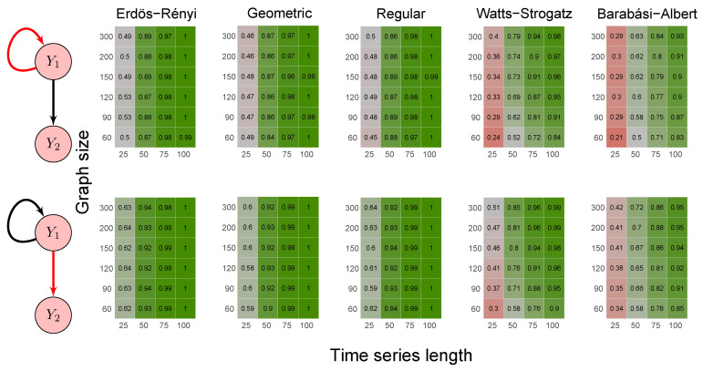
Figure 4.
Heatmaps represent the proportion of rejected null hypotheses at a p-value threshold of 0.05. At the left, we show the direction of G-causality (direction of the edges) in Scenario 2. Heatmaps on the right side represent the proportion of rejected null hypotheses highlighted in red in the left schema. The four columns of each heatmap correspond to the results obtained by varying the time series length . The six rows correspond to the results obtained by varying the sizes of the graphs (number of vertices) . The “greener” the heatmap is, the greater is the power of the test. In contrast, the “redder” it is, the lower is the proportion of rejected null hypotheses. We simulated five random graph models, namely Erdös–Rényi, geometric, regular, Watts–Strogatz, and Barabási–Albert.

