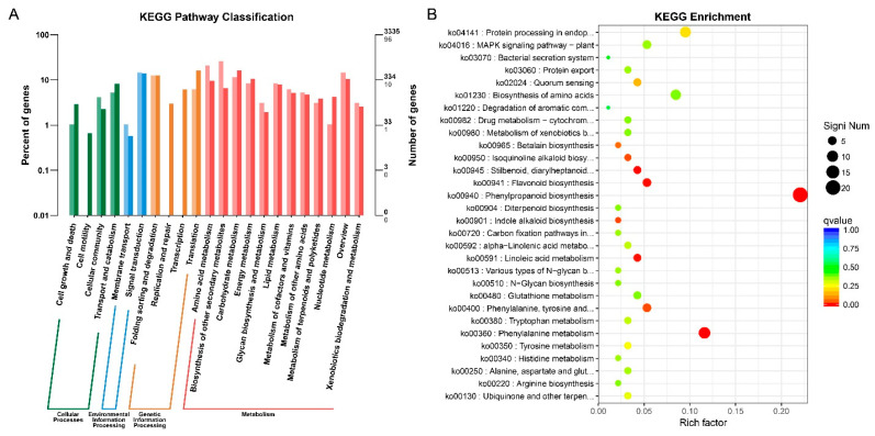
Figure 5.
KEGG analysis of DEGs for pl vs. WT by bar plot and scattered diagram. (A) DEGs analysis by bar plot. Horizontal and vertical axes represent functional category and number of genes in the category (right) and percentage of total genes on the annotation (left), respectively. Colors represent different categories of KEGG enrichment. Light color in the histogram represents the differentially expressed genes and dark color represents total number of genes. (B) Scattered plot represents the important enrichment functions. Horizontal axis represents the rich factor function, and the vertical axis represents functional annotation. Top 30 GOs were used for analyzing the Q value, where size is shown by dot color and the smaller Q value is close to red.

