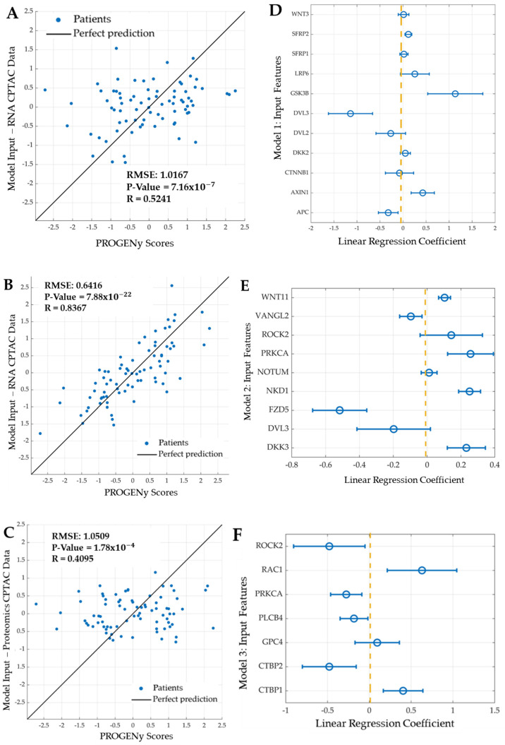
Figure 8.
Linear regression machine learning models of the mechanistic and canonical WNT signalling pathways. Scatter plot visualising the correlation between the predicted score from (A) Model 1, using the 11 features of the mechanistic model (y-axis), and the PROGENy scores (x-axis). (B) Model 2, using the nine features of the canonical WNT model and significant genes (y-axis), and the PROGENy scores (x-axis). (C) Model 3, using the seven features of the canonical WNT model and significant proteins (y-axis), and the PROGENy scores (x-axis). Each blue dot represents 1 of 79 patients in the cohort. The black line indicates perfect predictions. “R” denotes the Pearson correlation coefficient, and “RMSE” is the root mean square error. The second row of figures represents the corresponding linear regression correlation coefficients for Models 1–3. Presented are the regression coefficients for the (D) Model 1, (E) Model 2, and (F) Model 3. The features used for each machine learning model are shown on the vertical axis, with the associated correlation coefficients shown on the horizontal axis. The blue dot represents the regression correlation coefficient, and the blue line (error bar) is the associated standard error. The dashed vertical yellow line represents the midline for the linear regression coefficients at 0.

