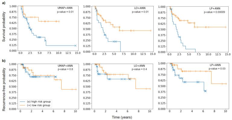
Figure 1.
Kaplan-Meier curves of high-risk (blue) and low-risk (orange) patient groups separated according to a threshold optimized during cross-validation. Significance of difference was assessed using the log-rank test. (a) Kaplan-Meier plots for OS endpoint. (b) Kaplan-Meier plots for LRF endpoint.

