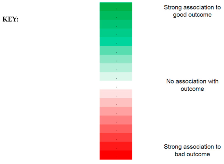
Figure 2.
Key to visual interpretation of Table 2, Table 3, Table 4, Table 5, Table 6 and Table 7. The strength of association can be visualised using the colour gradient denoted above where a more saturated green represents a stronger association to a good outcome, and darker red represents a stronger association to a bad outcome. In contrast, the lighter the shades of red or green, the closer the representation to having no association with the outcome (white).

