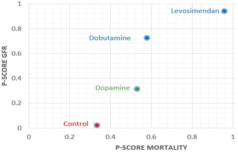
Figure 3.
P-scores ranking plot. The X axis represents the P-score of mortality and the Y axis represents the P-score of the glomerular filtration rate (GFR). The higher P-score corresponds to better results. Therefore, the dot in the upper right corner of the chart indicates a better treatment effect.

