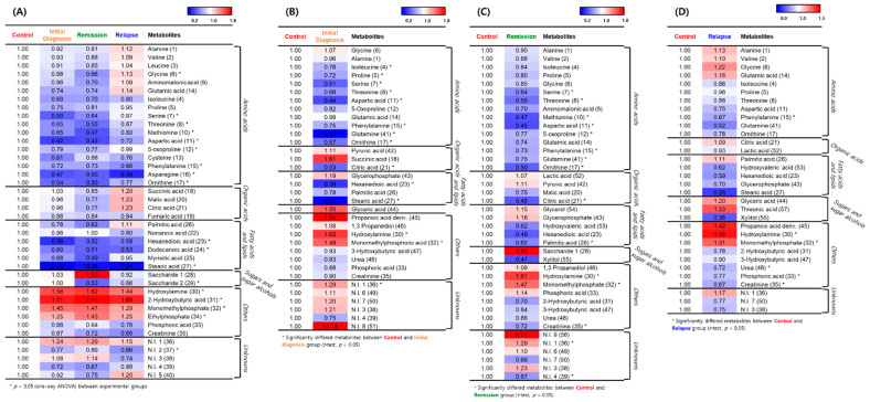
Figure 2.
Representative heatmaps for the relative contents of significantly different metabolites between the healthy individuals and patients with acute myeloid leukemia (AML). (A) Differences between the control group and the initial diagnosis, remission, and relapse patient groups. (B) Differences between the control and initial diagnosis groups. (C) Differences between the control and remission groups. (D) Differences between the control and relapse groups. The colored squares (blue-to-red) represent fold changes normalized by the average content of each metabolite in the control group. The color scheme is as follows: lower limit value, blue; middle value (1.0), white; and upper limit value, red. * means that metabolites significantly differed between the control and patient group.

