-
A
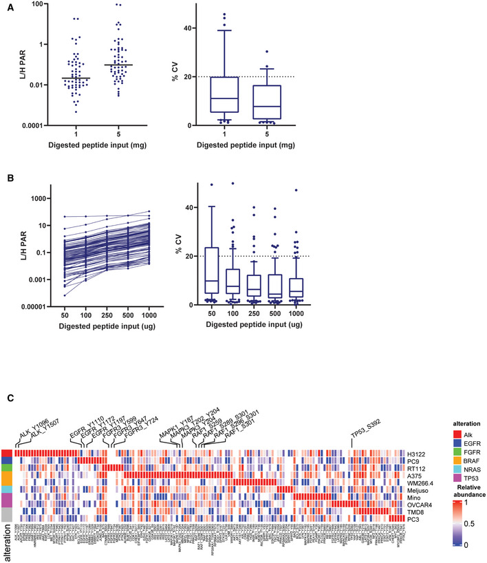
Average light/heavy peak area ratio and %CV of the three replicates for all quantified peptides in titration curve experiment after pY Ab enrichment. Plot on the left shows the average values for all the quantified peptides along with a line representing the median value at 1 and 5 mg input protein level. The plot on the right shows the spread of %CVs at 1 and 5 mg input protein. The box represents interquartile range (IQR) with the lower, central, and the upper bands representing 25th percentile (Q1), median, and 75th percentile (Q3), respectively. The whiskers extend from 10 to 90 percentile of the data.
-
B
Average light/heavy peak area ratio and %CV of the three replicates for all quantified peptides in titration curve experiment after IMAC enrichment. Plot on the left shows the average values for all the quantified peptides along with a line representing the median value at 0.05, 0.1, 0.25, 0.5, and 1 mg input protein level. The plot on the right shows the spread of %CVs at all the input protein levels. The box represents interquartile range (IQR) with the lower, central, and upper bands representing 25th percentile (Q1), median, and 75th percentile (Q3), respectively. The whiskers extend from 10 to 90 percentile of the data.
-
C
Heat map showing relative abundances of all detected phosphosites across the 10 cell lines. Labeled are phosphosites on known driver genes in these cell lines. One replicate of each samples was processed and analyzed for this experiment. The heat map was generated using Morpheus online tool, the data are median‐MAD normalized, and colors are relative across rows, from row min to row max.

