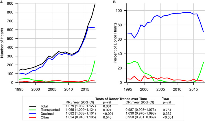
Figure 2. Trends in use of HCV‐positive donor hearts by year.

Graphs examining use of total HCV‐positive donor hearts from the years 1995 to 2018. A, the total number of donors who were HCV positive (black line), and number of HCV‐positive hearts transplanted (green line) have increased whereas HCV‐positive hearts declined for transplant (blue line) has leveled off since 2015. B, the percentage of donor hearts accepted for transplant (green line) and declined for transplant (blue line), and since 2015, the percentage of HCV‐positive hearts accepted for transplant has increased. RR represents the relative risk per year from the linear trend parameter of the Poisson model. OR indicates odds ratio.
