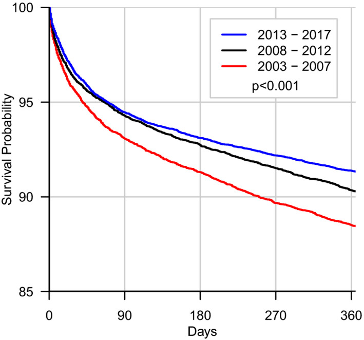
Figure 4. Kaplan‐Meier curve examining the different eras.

Kaplan‐Meier curves examining 1‐year all‐cause mortality across the different eras. The referent era (2003–2007) was found to have the worst mortality with the more recent eras having significantly lower 1‐year mortality in comparison.
