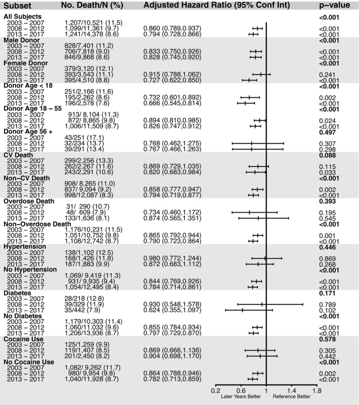
Figure 5. Risk of death among heart transplant recipient according to donor characteristics and by different time periods.

Forest plot examining the risk of death for recipient associated with each individual donor characteristic in 2008 to 2012 and 2013 to 2017 comparing with 2003 to 2007 is displayed. All models were adjusted with the same covariates used primary adjusted models. Bold P values assess the omnibus 3‐era comparison. Other P values asses the relevant era to the 2003 to 2007 reference era. CV indicates cardiovascular.
