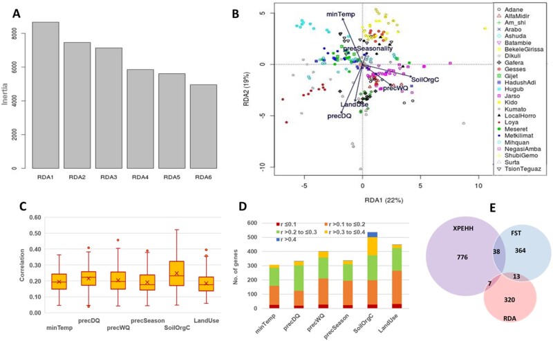
Fig. 4.
(A) Variance explained by RDA axes; (B) PCA plot based on RDA axes 1 and 2; (C) Box plots showing the distribution of correlation values of outlier SNPs associated with different environmental predictors; (D) stacked bar graph showing number of genes linked to RDA outlier SNPs and their split based on environmental correlation; only genes (with r ≥ 0.3) were finally considered as candidates; (E) Venn diagram showing overlaps of candidate genes between selection signatures and RDA analyses.

