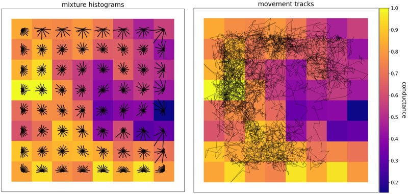
Fig. 2.
A raster layer representing a movement surface with example movement histograms for each cell (left) and a movement track for a sample individual (right). The circularized histograms represent the movement directions that could be drawn from the von Mises mixture distribution approximations within each cell. Longer bars in a histogram indicate higher probability of movement in their direction. The movement track, plotted with the gnx.help.param_help.plot_movement function in Geonomics, is 5,000 steps long. Both preferential movement toward higher-suitability regions of the landscape (i.e., cells closer to 1 in value) and occasional long-distance movements between relatively isolated portions of the landscape are evident.

