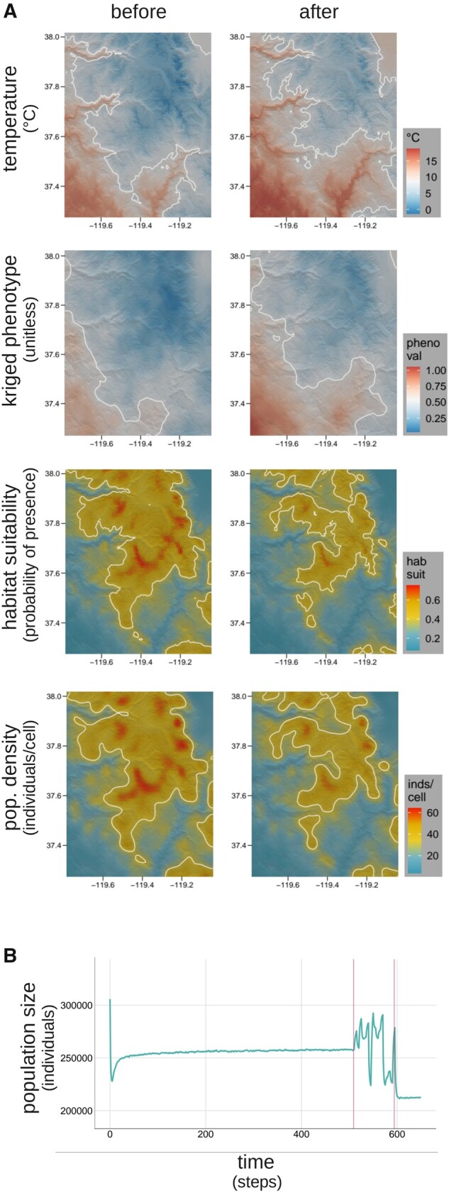
Fig. 5.

Polygenic adaptation to climate change in the Yosemite region. (A) Hillshade plot comparisons of key variables (mean temperature, phenotype, habitat suitability, and population density) before and after the simulated climate change event. The mean of each variable through time is used to draw midvalue contours on each map (white lines) to help visualize spatial change. As expected, the spatiotemporal shift in temperature (first row) drives a spatially corresponding shift in phenotypes, visualized as a surface kriged from all phenotypic values (second row), and the shift in habitat suitability (third row) likewise drives a corresponding shift in population density, visualized using a 2D kernel density estimator (fourth row). (B) The time course of population size. The early drop in population size results from the onset of natural selection after completion of the unplotted burn-in portion of the model. The oscillations and ultimate reduction at the end of the simulation are a result of the climate change event, which occurs during the period bracketed by vertical red lines.
