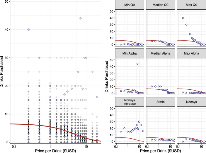
Fig. 2.
Results from the Fit-to-Group Approach. Note: Left panel: Individual points in gray and subset of participants from right panel in open purple diamonds. Black vertical bars indicate the interquartile range between 25% and 75%. The red line shows the best fit line from the fit-to-group approach. Right panel: A subset of participants and their responses. The red line in each pane is identical to the fit-to-group approach demonstrating each participant has the identical predicted values. Visual inspection reveals that the best fit line is inadequate to characterize the data for a number of participant datasets

