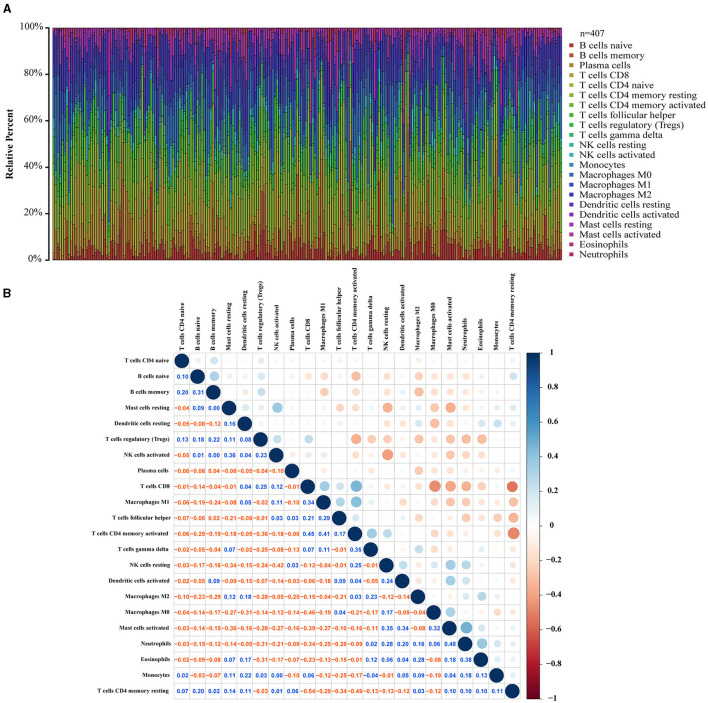
Figure 7.
TIC spectrum and correlation analysis in GC samples. (A) The bar graph shows the proportion of 22 TICs in the GC. (B) The heat map shows the correlation between 22 TICs (Pearson coefficient test). The number represents the p-value corresponding to the correlation between the two immune cells. The color depth of each box represents the corresponding correlation value between the two types of immune cells.

