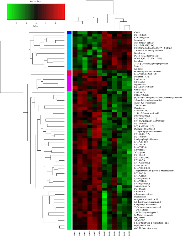
Figure 6.
Hierarchical clustering analysis (HCA) and heat map for different milk metabolites from the CON and AOB groups. The heatmap shows the significantly changed metabolites between the two groups. Columns in the heatmap represent one sample, and rows represent one metabolite. The color bar showing green to red indicates the relative content of the metabolites (n = 6).

