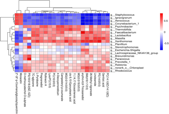
Figure 8.
Correlation analyses between milk bacteria genus and altered metabolite levels in the CON and AOB groups. Each row in the graph represents a genus, each column represents a metabolite, and each lattice represents a Pearson correlation coefficient between bacteria and metabolites. Red represents a positive correlation, while blue represents a negative correlation (*0.01 < p < 0.05; **0.001 < p ≤ 0.01; ***p < 0.001).

