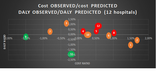
Figure 2.

Graphic of observed cost/predicted cost and observed DALY/predicted DALY from linear regression among 12 Belgian hospitals. This graph identifies the position of hospitals regarding their performance in terms of costs and DALYs. A bubble represents a hospital and is based on the data from table 4. Hospitals with a red colour suggest that both variables are unfavourable, hospitals with a green colour suggest that both variables are favourable and hospitals with an orange colour suggest that one of the two variables of the hospital is favourable. DALY, disability-adjusted life years.
