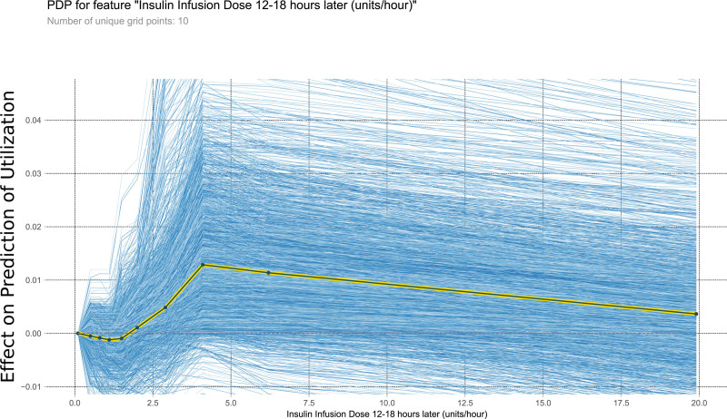
FIGURE 7.
This PDP shows the relationship within the model between insulin infusion dose 12–18 h later and the outcome of interest. It measures the variation in prediction for every row of the training set as the insulin infusion dose 12–18 h later is iteratively changed to every possible value seen in the training set for that variable (blue lines). The yellow and black line shows the average of the trend of the relationship of the many individual blue lines. Values above 0 on these plots suggest the variable is positively correlated with a prediction of nontransplantation, whereas negative values suggest correlation with prediction of transplantation. PDP, partial dependency plot.

