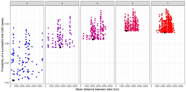
Figure 6.
Probability of a successful trial (defined as ≥60 cases for an enrolled population of 15,000 across all enrollment sites in 1 year) by the mean distance between sites (in kilometers). The panels represent numbers of sites and points represent combinations of sites from the top 15 sites with the highest average site-level incidence of infection across all simulated outbreaks in 1 year (2017) that had a higher probability of success than the combination of sites with the highest projected incidence (represented by the black dot). Enrollment is assumed to be spread evenly across sites. We have included combinations of 3–7 sites of the top 15 sites for illustration, but this process could be extended to any number of sites.

