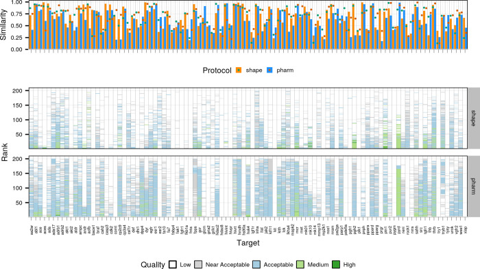
Figure 3.
Comparison of template quality and performance for the two protocols. The top panel highlights the similarity (orange and blue bars for the shape- and pharmacophore-based protocols, respectively) and overlap (green and dark green dots for the shape- and pharmacophore-based protocols, respectively) between the reference and template compounds. The bottom panel compares the performance for the semi-flexible refinement stage of HADDOCK (it1) for the two protocols. Each column corresponds to one target with the y axis reflecting the ranking of models (ranks close to 0 refer to top-ranked models and those close to 200 to bottom-ranked models) and the color of each model reflecting its quality (see description of Figure 2).

