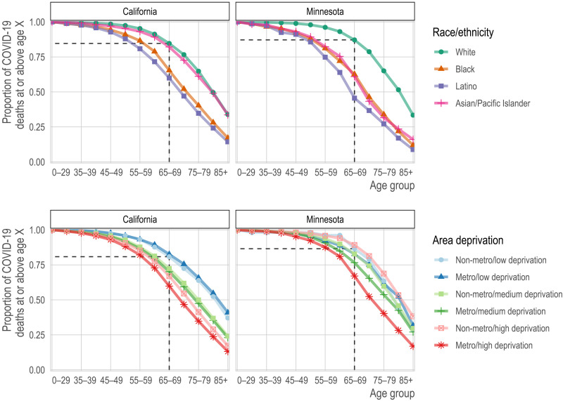
Fig. 1. Proportion of COVID-19 deaths by race/ethnicity (top row) or geography (bottom row) and age group (x axis) for each state (columns).
Each line corresponds to the proportion of deaths (y axis) at or above each successive age group (x axis). In the top row, each line corresponds to a racial/ethnic category. For reference, we show the proportion of deaths among non-Hispanic whites ages 65 and older. For nearly all other racial/ethnic groups, the proportion of deaths at age 65 is lower. Correspondingly, for nearly all other racial/ethnic groups, the same proportion of deaths occurs at substantially lower ages. In the bottom row, each line represents a metropolitan area and deprivation level. Darker shades are metropolitan, while lighter shades are non-metropolitan. Blue is low deprivation, green is medium deprivation, and red is high deprivation. The reference lines show the proportion of deaths at ages 65 and above among non-metropolitan, low-deprivation areas.

