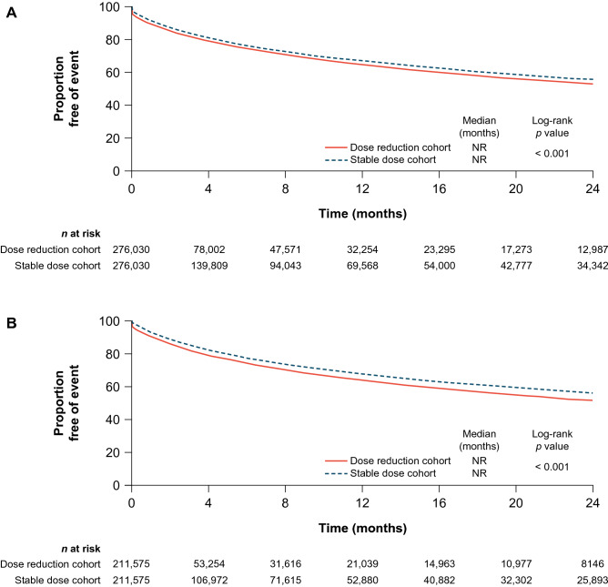
Fig. 2.
Time to the all-cause inpatient visit in the a ≥ 10% and b ≥ 30% dose reduction cohorts in the overall population. These are Kaplan–Meier graphs describing the time to all-cause inpatient visit in the ≥ 10% and ≥ 30% dose reduction and stable dose cohorts in the overall population. The x-axis represents time in months at an interval of 4 months, and the y-axis represents the proportion of patients free of event. The median time to the all-cause inpatient visit was not reached (NR) for the ≥ 10% and ≥ 30% dose reduction and stable dose cohorts, with p values of < 0.001 in both comparisons

