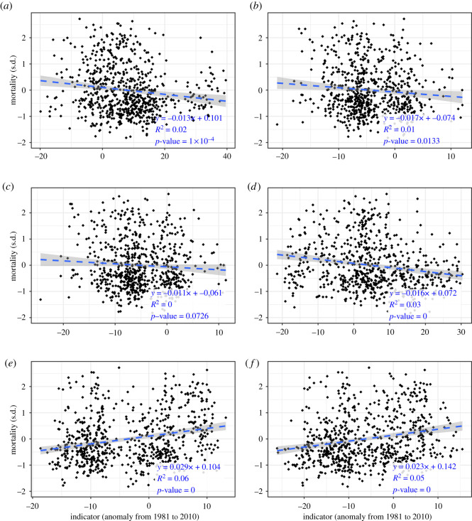
Figure 3.
Scatterplots of indicator (x-axis) versus mortality rate (y-axis) anomalies for all years and districts with valid data. Linear regression trend lines are shown as blue dashed lines; the grey area shows the 95% confidence interval. The model's coefficients, significance (p-value) and R2 values are annotated in the graph. Increasing (decreasing) trend lines signify a positive (negative) correlation between the indicator and mortality rates. (n = 700). (a) Days with optimal flying conditions. (b) The maximum duration of late autumn cold spells. (c) Days in late autumn cold spells. (d) Mild winter weather. (e) The maximum duration of winter cold spells. (f) Days in winter cold spells.

