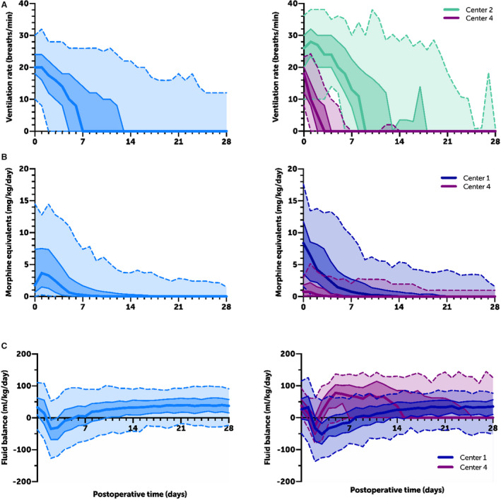
Figure 2. Exemplary care curve plots.

Care curves for (A) postoperative daily ventilation rate, (B) opioid total daily dose, and (C) daily fluid balance for all patients in the cohort (left) and at the 2 centers that differ from each other the most (right). Dark center line=median; dark shaded and solid middle lines=interquartile range; light shaded and dotted outer lines=5% and 95%.
