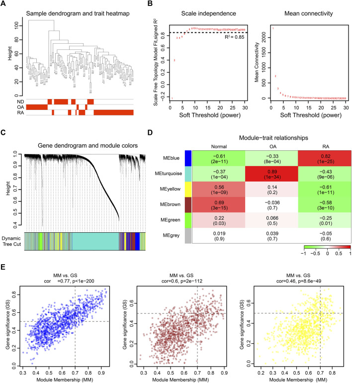
FIGURE 3.
WGCNA of the integrated dataset. (A) Sample dendrogram and trait map. (B) Selection of the soft-thresholding power β. The left panel showed the scale-free fit index versus soft-thresholding power β. The right panel displayed the mean connectivity versus soft-thresholding power β. The soft-thresholding power β was selected as 7 to make the fit index curve flat (R2 > 0.85). (C) Gene dendrogram obtained by average linkage hierarchical clustering. The color row below the dendrogram shows the module assignment determined by the dynamic tree cut. (D) Model-trait relationships. Each row and column in the heatmap correspond to one module (labeled by blue, turquoise, yellow, brown, green, and grey). Besides, the green color in the heatmap represents the negative correlation, and the red color represents the positive correlation. (E) The scatter diagram of GS versus MM in blue, brown, and yellow modules. The gene closer to the upper right corner is more related to RA.

