
Figure 6.
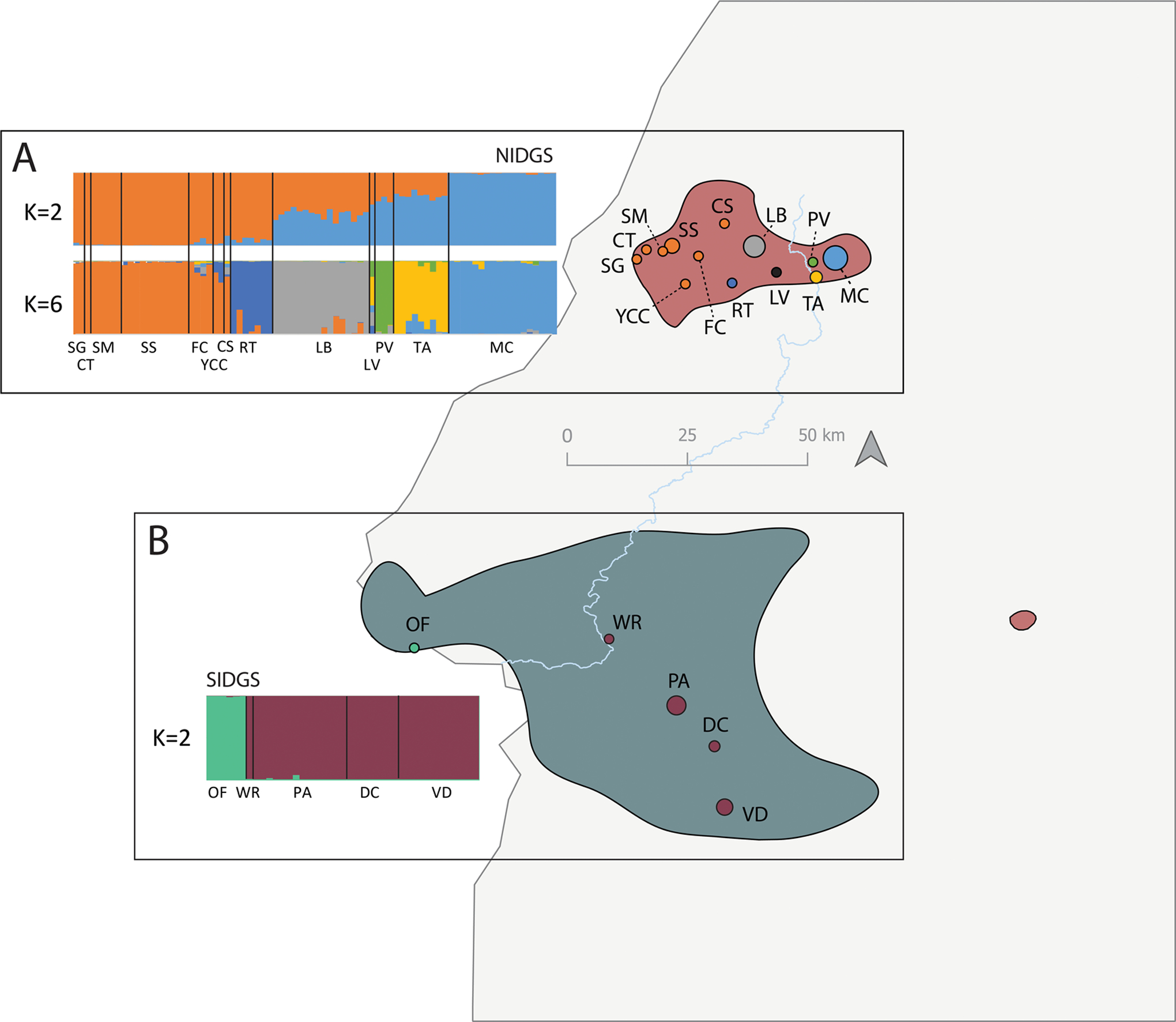
Population structure analyses and conservation unit delimitation for the NIDGS (A) and SIDGS (B). STRUCTURE barplots represent the most supported K (K = 2) for the neutral datasets using the Evanno method, after excluding loci deviating from HWE. For NIDGS, we further included K = 6, as the second most supported K, as it also provided biologically meaningful results. Populations on the map are colored according to the largest proportion of assignment to a given K population based on K = 6 in NIDGS and K = 2 in SIDGS. For NIDGS, the population LV is colored black due to multiple mixed ancestry. Within each species, different colors match the STRUCTURE plot population symbols represent. Locality codes refer to localities listed in Table 1. Background red and blue areas represent the distribution of NIDGS and SIDGS, respectively. The light blue and gray lines represents the Weiser River and the Idaho state border, respectively.