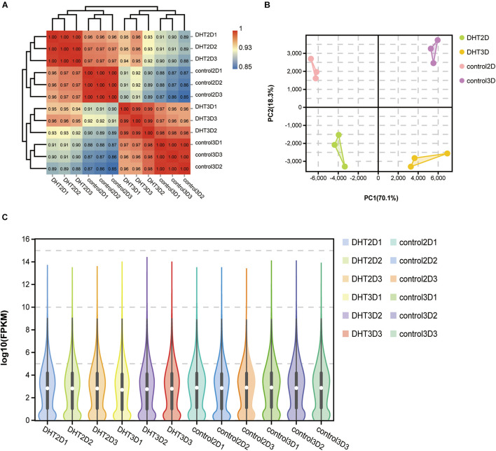
FIGURE 4.
Correlation analysis between samples. (A) Logarithm-transformed counts from RNA-seq dataset of control-2D, DHT-2D, control-3D, and DHT-3D used for Pearson’s correlation analysis. R2 values from Pearson’s correlation analysis were plotted inside the grids of the heatmap. (B) PCA analysis. Percentages in PCA axis indicate the proportional variance explained by each PC. Control-2D samples are labeled pink, DHT-2D samples are labeled green, control-3D samples are labeled purple, and DHT-3D samples are labeled yellow, representative of conditions located in the upper right part of plot. (C) Violin plot visualizing data density at any location of all genes in each sample, indicating gene abundance expression. White dots represent the median, the black rectangle represents the lower quartile (Q1) range to the upper quartile (Q3), and black lines running through the violin chart represent the confidence interval. The outer shape of the black rectangle is the kernel density estimation, the length of the longitudinal axis of the figure represents the degree of gene dispersion, and the length of the horizontal axis represents the amount of gene expression distribution in a certain ordinate position. DHT, dihydrotestosterone; PCA, principal component analysis.

