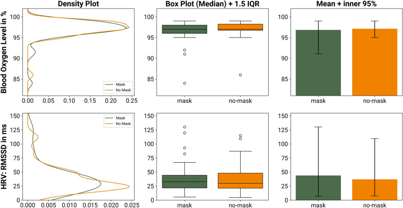
Figure 2.
Comparison of the physiological metrics (blood oxygen level and HRV) while wearing an FFR and not wearing an FFR. The density plots to the left describe the similarity of the distributions of the two groups. The box-plots in the center column compare the median and the interquartile range (IQR) and provide an assessment of potential outliers. The bar charts to the right compare the plain mean of the two group; the whiskers depict the inner 95% of the recorded data.

