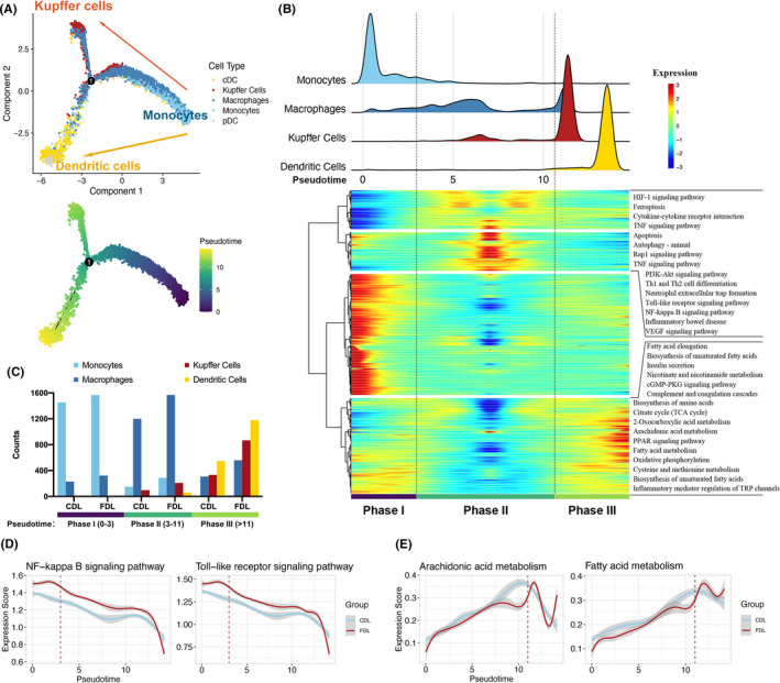
FIGURE 3.

Trajectory analysis of myeloid‐derived cells. (A) Trajectory of differentiation from monocyte into macrophage and dendritic cell (DC) predicted by monocle. The lines indicating the trajectories of lineages and the arrows indicating manually added directions of the pseudotime. Dots: single cells; colours: cell types. (B) Heatmap revealing the dynamic changes in gene expression during the differentiation process. The distribution of myeloid‐derived cell subtypes during the transition was divided into 3 phases (lower panel), along with the pseudotime. Subtypes are also labelled by colours (upper panel). Difference in enriched pathways by KEGG between different phases (right panel). (C) Histogram indicating the proportion of myeloid cells in liver tissue of each group. (D‐E) Two‐dimensional plots showing the expression scores for inflammatory (D) and metabolic pathways (E), in CDL (blue) and FDL (red) samples, along with the pseudotime. CDL, control donor liver; FDL, fatty donor liver
