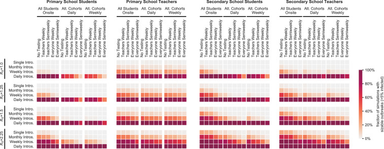
Fig. 4.
Effects of cohorting and testing strategies. Heatmaps illustrate the interactions of three student cohorting strategies and five proactive testing strategies (horizontal axis) across a range of transmission levels () and new case introduction rates (vertical axis). The color of each cell indicates the fraction of 1,000 simulations for the given parameter set that result in sizable outbreaks where more than 5% of the population is infected. Outcomes are shown for student and teacher populations in primary and secondary schools as indicated by the title above each heatmap.

