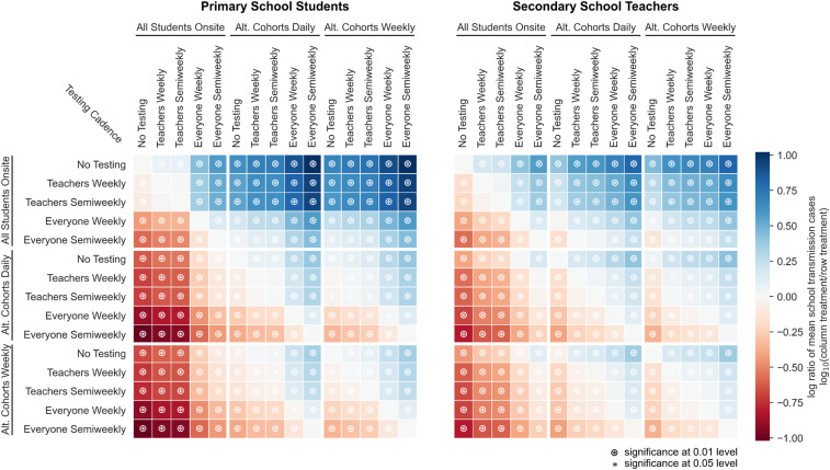
Fig. 6.
Relative effects of testing and cohorting in a secondary school setting. A heatmap of pairwise comparisons of testing and cohorting interventions illustrates the effects of various combinations on mean outbreak sizes. Each cell is colored according to the log-ratio of mean outbreak sizes for the two interventions, which represents the effect of the column intervention relative to the row intervention. A blue cell indicates that the column intervention achieves a lower mean outbreak size than the row intervention; a red cell indicates that the column intervention has worse outcomes than the row intervention on average. Symbols in cells denote statistically significant differences in outbreak size distributions according to the Mann−Whitney U test at the 0.01 () and 0.05 () levels. Results are shown for scenarios where R0 = 1.5, case introductions occur weekly on average, and only the positive individual is quarantined when cases are detected.

