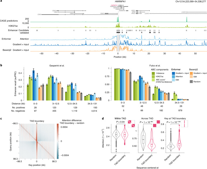
Fig. 2. Enformer attends to cell-type-specific enhancers, enabling enhancer prioritization.
a, HNRNPA1 locus showing: predicted CAGE expression in K562; measured H3K27ac highlighting active enhancers; candidate (light gray) and CRISPRi-validated enhancers (dark gray) exhibiting significant HNRNPA1 expression changes from Fulco et al.13; enformer attention weight averaged across all layers and heads for a query placed at the main TSS of HNRNPA1 gene (position 0); and gradient × input12 contribution scores computed with regard to the K562 CAGE track at the main TSS position for Enformer and Basenji2. b, Enhancer–gene pair classification performance (CRISPRi-validated versus nonvalidated candidate enhancers), stratified by relative distance, as measured by auPRC on two CRISPRi datasets9,13 for different methods, models, and contribution scores (Methods). ABC score* (H3K27ac/distance) denotes the approximate version of the ABC score13 lacking Hi-C data, which exhibits similar performance (Extended Data Fig. 7a). Colored bars depict the median auPRC, and error bars show the 25th and 75th percentiles obtained by sampling 80% of enhancer–gene pairs 100 times without replacement. The auPRC metric is sensitive to class imbalance, which differs between the two datasets (1:10 for Gasperini9 and 1:4 for Fulco13). c, Average attention matrix difference of Enformer between 1,500 sequences centered at a topologically associating domain (TAD) boundary and 1,500 sequences from the validation set without any particular centering. Attention matrices were averaged across all layers, heads, and sequences. Red stripe in the center at key = 0 means that the model is attending more to the TAD boundary than by chance. Blue regions in off-diagonal quadrants mean that the model is attending less across the TAD boundary. d, Attention is significantly lower across TAD boundaries (center), significantly higher at TAD boundaries (right), and shows no significant difference within them (left), as compared with 1,500 random genomic sequences. Distributions show attention across all sequences in specific attention matrix parts shown in red. P values were computed with the two-sided Mann–Whitney U test. The box plots mark the median, upper and lower quartiles, and 1.5× interquartile range (whiskers); outliers are shown as points (n = 1,500 for each violin plot).

