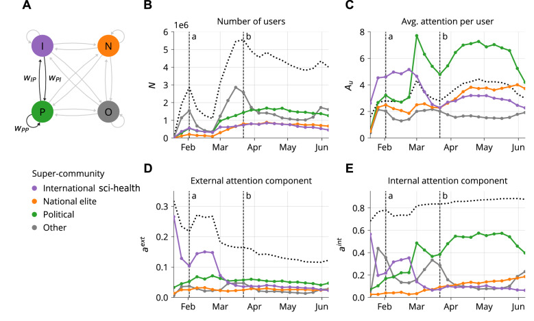
Figure 4.
Evolution of weekly aggregated networks by super-community, with dotted lines corresponding to the statistics across all users. (A) Diagram representing the networks collapsed to the super-community level. Edge direction represents the flow of information via retweets, i.e. from retweeted to retweeting super-community. (B) Size of the super-communities in terms of number of users. (C) Average attention per user. (D) External component of the attention toward super-communities. (E) Internal component of the attention toward super-communities. Indicated as a and b are the first and second peak in terms of network size, as shown in Fig. 4b.

