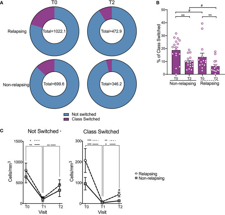
Figure 4.
Changes in not switched and class switched B cells after anti-CD20 Ab therapy. (A) Doughnut pie graph of the number of class switched B cells (total = average number of class switched and not-switched cells per sample) before anti-CD20 treatment (T0) and at relapse (or at the same time point after anti-CD-20 therapy in non-relapsing patients) (T2). (B) Bar graph illustrating the percentage of class switched B cells. (C) Changes in absolute numbers of not switched and class switched B cells in relapse and non-relapsing patients at T0, T1 and T2. Comparisons between the relapsing and non-relapsing groups at the same timepoint #p < 0.05. Comparisons between different timepoints *p < 0.05, **p < 0.01, ***p < 0.001. Two-way ANOVA corrected for multiple comparisons. Bar plots and data points depict mean ± SEM.

