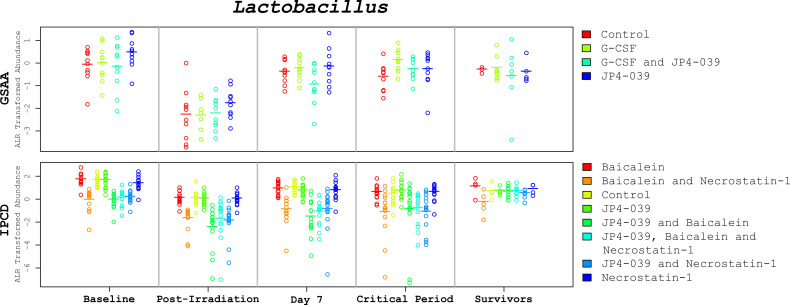
Figure 4.
Lactobacillus abundances across the time points. These plots depict the change of Lactobacillus levels (alr transformed) across critical time periods. The GSAA and IPCD experimental results are positioned at the top and bottom, respectively. Each annular glyph represents an individual mouse and each horizontal bar represents the median for each treatment group. The order of the treatment groups from left to right, match the colors and order in the legend on the right margin, from top to bottom. The values represented in the critical period (days 9-24) are the average across the available samples for each mouse. These plots illustrate not only how the median Lactobacillus levels change between time points, but also the degree of variation within each treatment group. In spite of treatment group specific variation at baseline, the relative change of Lactobacillus appears to be conserved, suggesting that the observed changes are not simply an artifact of mean reversion.

