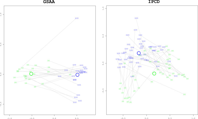
Figure 5.
Multidimensional Scaling (MDS) plots comparing Baseline to Day 30 for Survivors. These ordination plots generated with the MDS algorithm illustrate that the overall composition of the survivors at day 30 (“D30”, blue) have changed significantly from baseline at day 0 (“D0”, green). The two dimensional (x and y axes) spatial relationships of the samples represent the degree of difference of taxonomic composition between the samples. Paired day 0 and day 30 samples from the same mouse are connected with grey lines. The x and y axes are unitless representations of the sample distance/dissimilarity estimated by the MDS algorithm. In both experiments, the difference in composition, as measured by the Manhattan distance, was statistically significant with bootstrapped p-values < 0.0001. As can be visually confirmed, the distance between the centroids of each group (represented by the green and blue annuli, representing day 0 and day 30, respectively) is greater than the dispersion within each group (the average distance between a group’s centroid and each of the members in the group).

