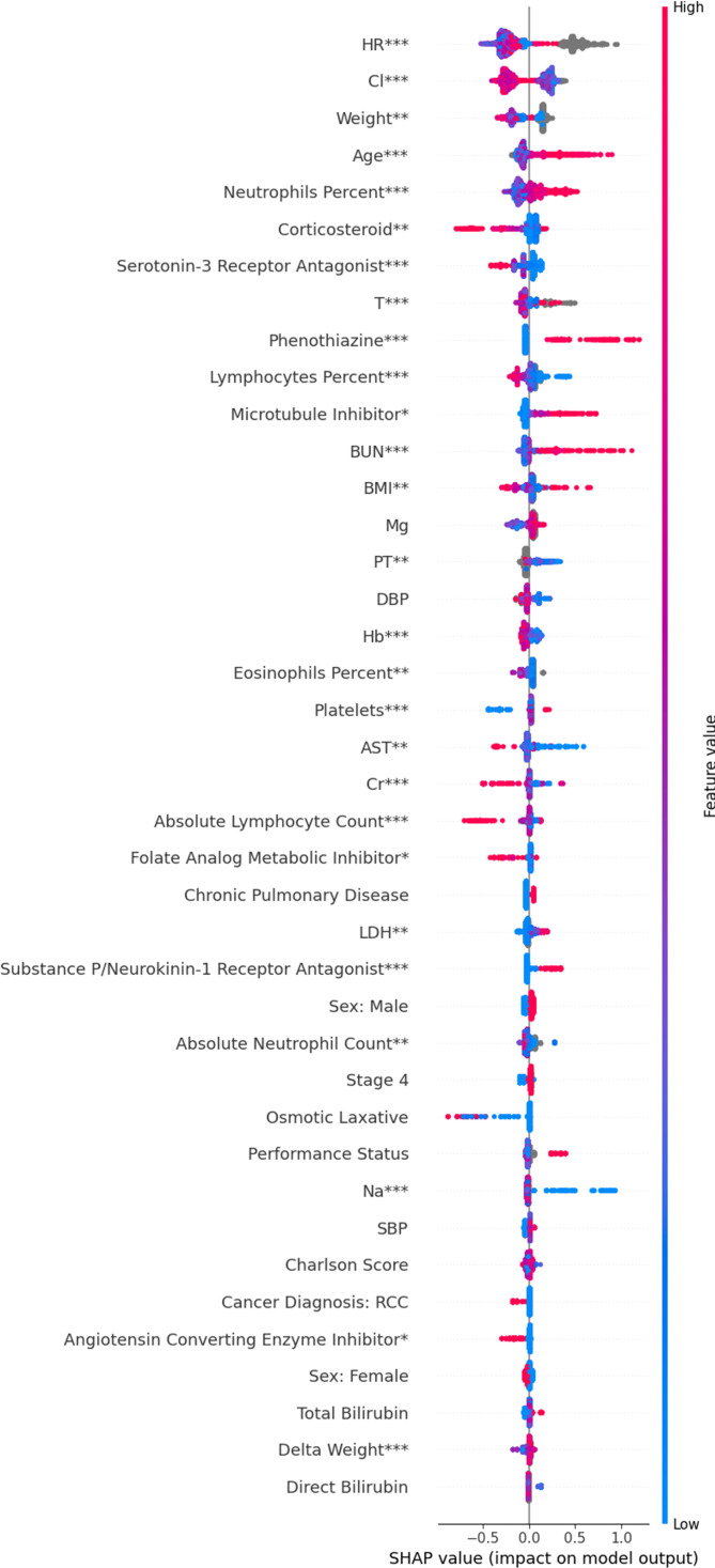
Figure 1.
SHAP summary plot for interpreting the impact of features on our model. Each row shows the impact of a single feature on the model’s predictions. Within each row, each dot represents a patient. Red means patients had a high feature value; blue means patients had a low value; gray means patients had a missing value. The position of the dot along the x-axis indicates whether that feature increased or decreased a patient’s predicted risk. When all the red dots are on the right, a high feature value was associated with increased risk. When all the blue dots are on the right, a low feature value increased risk. Statistical significance is indicated as follows: *p<0.05, **p<0.01, ***p<0.002. BMI, body mass index; Cr, Creatinine; DBP, Diastolic Blood Pressure; SBP, Systolic Blood Pressure; Hb, hemoglobin; SHAP, Shaply additive explanations.

