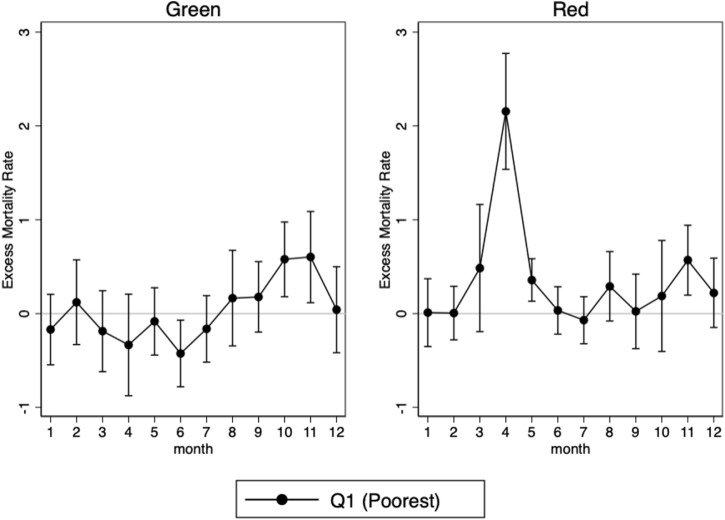
Fig. 4.
Gradient in excess mortality by zone.
NOTE: The graph plots the point estimate and the 95% confidence intervals of the estimation of from Eq. (2) evaluated each month on each zone separately. It accounts for the monthly difference in all-cause excess mortality between the poor municipalities and the rest in each zone, where poor is defined as belonging to the bottom quartile of the national distribution of municipal median income weighted by the municipality size. The red zone corresponds to the areas that were the most severely hit by the first wave, and that are located in the North-Eastern quarter of the country. This zone covers about 44% of the urban population of (mainland) France. The green zone encompasses the rest of the French territory.

