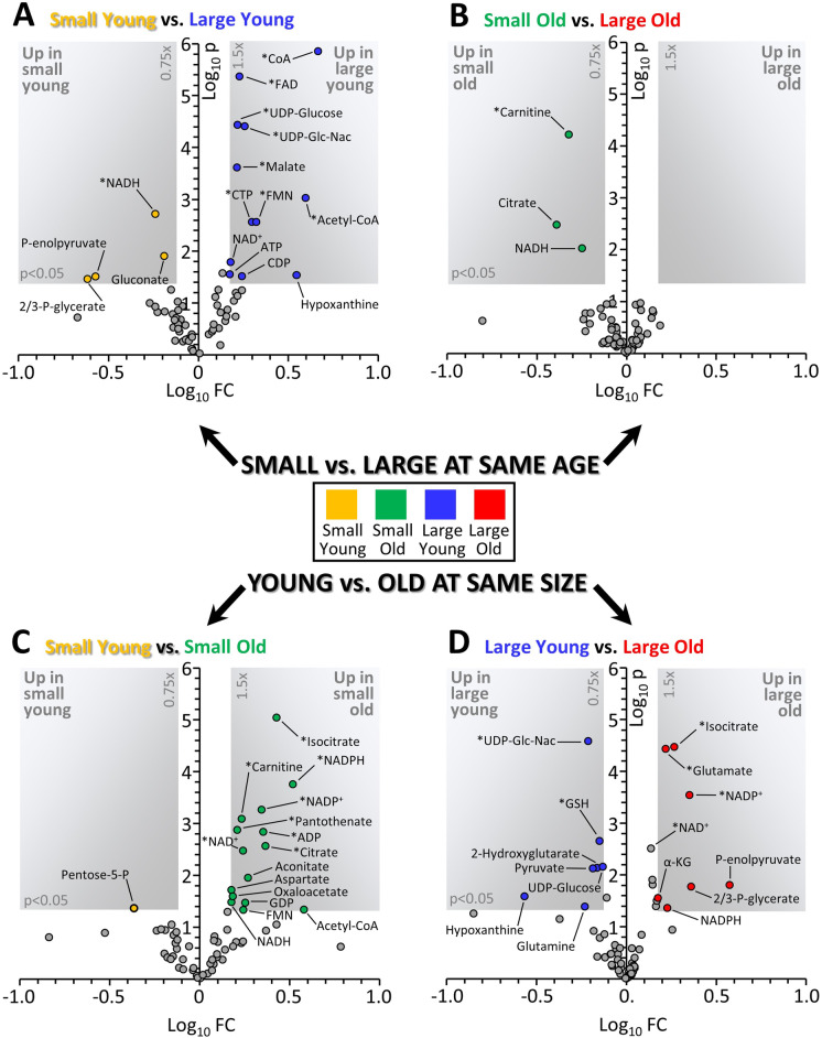
Fig. 2.
Volcano plots depicting changes in metabolome depending on size or age. Graphs show Log10 of the fold change (x-axis) and Log10 of the p value from an unpaired heteroscedastic t-test (y-axis) for each metabolite. Gray-shaded areas in each plot indicate thresholds of 0.75–1.5 fold change and p = 0.05. Those metabolites which remained significant after correcting for a false discovery rate of 5% [15] are marked with an asterisk. A Comparison of cells from small young vs. large young dogs. B Comparison of cells from small old vs. large old dogs. C Comparison of cells from small young vs. small old dogs. D Comparison of cells from large young vs. large old dogs. Data points are means, with number of replicates for each group indicated in Supplementary Table 1. Color coding of groups is as per Fig. 1

