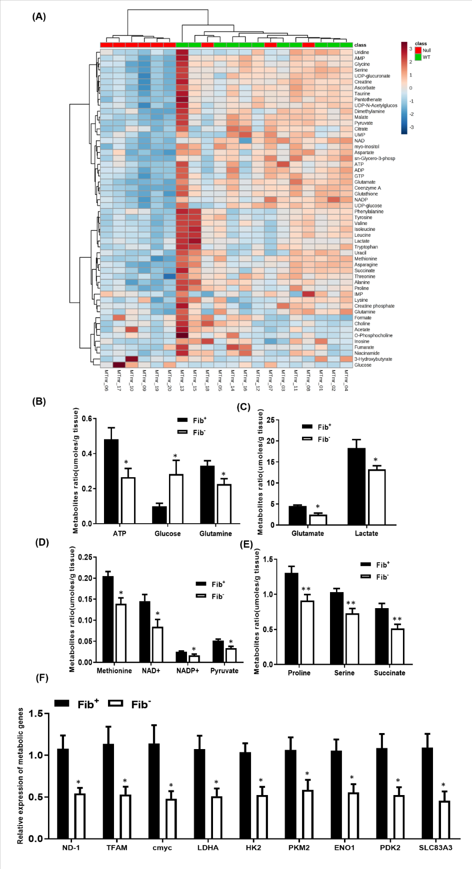
Figure 6. Fibrinogen promotes tumor metabolism.

(A) Heat map showing the patterns of different metabolites in Fib− vs Fib+ tumor tissues. (B) Bar graphs showing significant fibrinogen-dependent differences in multiple key metabolites. Metabolite concentrations (umoles) are normalized to tissue mass. (Fib+, n=9; Fib−,n=11; *p < 0.05, **p < 0.001 Kruskal–Wallis test) (C) Bar graph showing the transcript levels of key metabolic genes in tumor tissues harvested from Fib+ and Fib− mice. Bars and error bars represent mean and SEMs (n=6 per cohort, Mann-Whitney U test, *p < 0.05).
