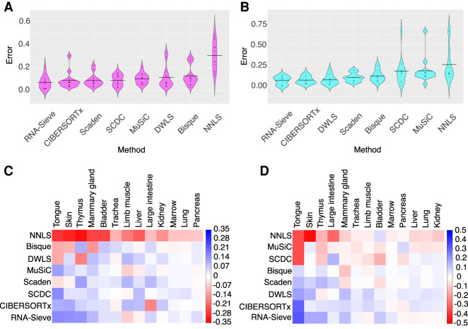
Figure 2.
Distribution of errors for each method in pseudobulk experiments. Pseudobulk experiments were performed in 13 different organs using data from the Tabula Muris Senis experiment. Errors were computed as the average L1 error across cell types in each organ. (A,C) Smart-seq2 reference, 10x Chromium pseudobulk. (B,D) 10x Chromium pseudobulk, Smart-seq2 pseudobulk. In the violin plots (A,B), horizontal black bars correspond to the mean error and methods are ordered left to right from lowest to greatest mean error. In the grid plots (C,D), methods and organs were ordered using SVD-induced clustering. Roughly speaking, the methods from top to bottom are characterized by improving performance, whereas the organs from left to right are characterized by decreasing variability in different methods’ performances. Color indicates the difference between the average error across methods in that organ; deeper shades of red (blue) indicate poor (good) relative performance. See Supplemental Table S2 for context regarding the cell types present in each organ.

